I’m Marcin Jakubowski
For the last 17 years I’ve been doing concept art and illustration for a living.
At some point I realized it was a storytelling that drove my imagination and I started pursuing my dream about filmmaking.
Currently
I’ve completed my quest on “Klaus” feature animation as a production designer.
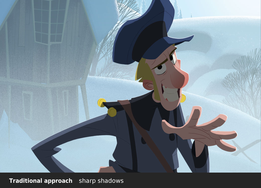
“Klaus” is a very special project for me. I’ve been involved in it from the very beginning. In 2012 I helped Sergio Pablos illustrate his elaborated pitch book. Three years later we made a proof of concept that was enthusiastically received by animation community, mainly because we introduced a ground breaking 2D shading method applied to traditional hand crafted animation.
After almost 3 years of production “Klaus” has been finally revealed. The reception is overwhelmingly positive and I’m happy to hear that both the story and the visuals make people emotional.
Go watch it on NETFLIX!
“Klaus” got 7 Annie Awards. Alongside with Szymon I got an individual Award for Outstanding Achievement for Production Design.
Besides that we got BAFTA award and a nomination for an Oscar for the best animated feature!
Production Design on “Klaus”
Production designer is a person responsible for the final look of the movie. On Klaus I share this role with my friend Szymon Biernacki. We have developed the foundation of the style for the teaser and refined it during the full feature production. The visual language that we established is not only something that we like, but is the integral part of the storytelling style. We will definitely try to explain the process more after the movie is finished. We are working hard with all the departments to maintain the consistency and quality of the visuals. So far so good!

Shading System in “Klaus”
I had an opportunity to develop the shading system for 2D animation. In a traditional approach animated characters are just flat cels put on a fully rendered backdrop. If there’s any shadow on them it’s either entirely sharp or uniformly soft. This makes the character flat and detached from the background. I’ve found a way to apply different aspects of light onto the character i.e. shadows, bounced light, ambient light, skin translucency etc. This way we make the characters visually appealing, volumetric and fully integrated with the surrounding background. “Klaus” is the first project using this technique.
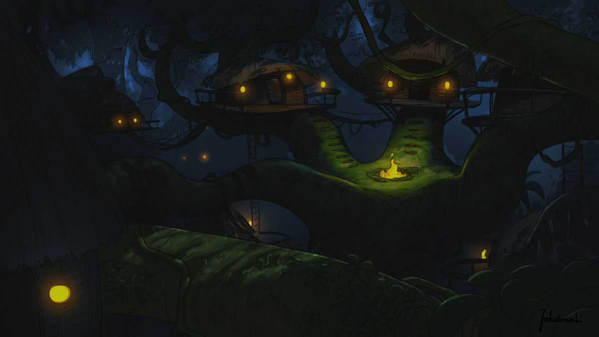
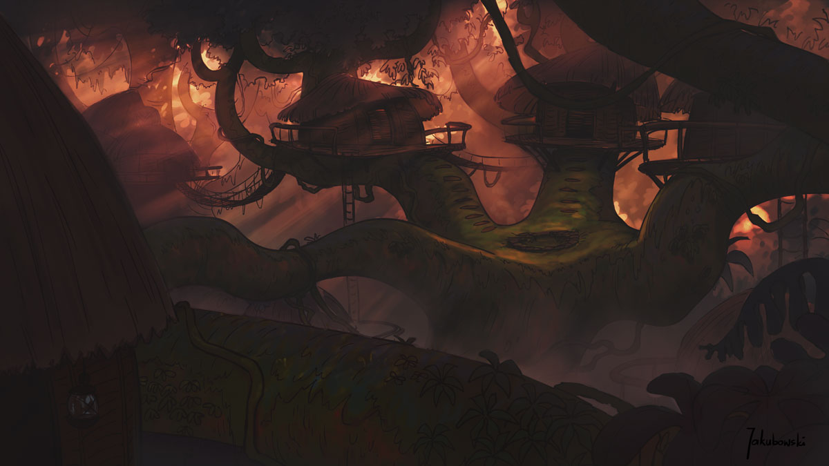
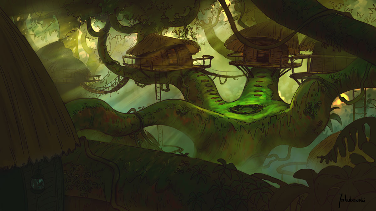
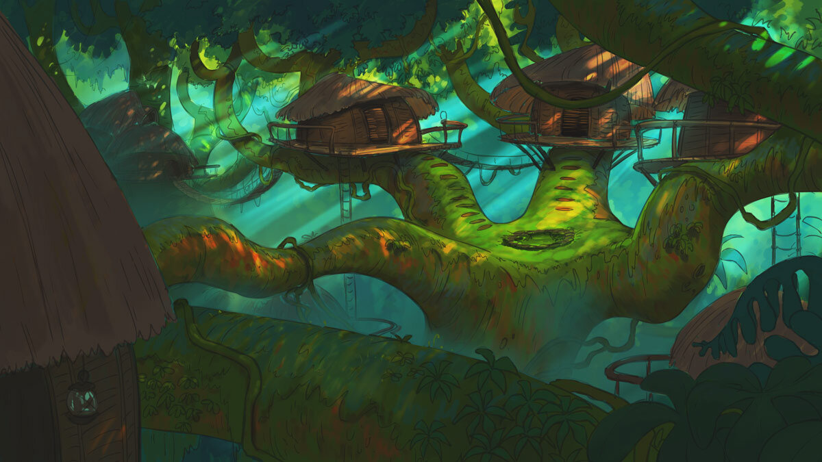
Some concept art and backgrounds that I’ve painted for the teaser:
more to come!
"Smallfoot”
The other feature animation that I worked on with SPA Studios was “Smallfoot”. The original idea comes from Sergio Pablos. He flipped the legend about the Bigfoot upside down. In his story it is the yeti who tries to prove the existence of humans by capturing and bringing one of them to yetis’ community.
Unfortunately almost all our development was discarded and the slapstick comedy that has been released eventually has nothing to do with our version. And… it turned out to be a musical :) Well, that happens quite often, but I definitely prefer our vision!

I was involved in the development before the screenplay writing even started. It was an interesting experience because we were supposed to come up with a world that would inspire the writers as they were working on the script. The original story by Sergio was more adventurous that’s why the initial designs are more epic and realistic. We had great time developing yetis’ surrounding, society rules, small story beats and the look of the movie.
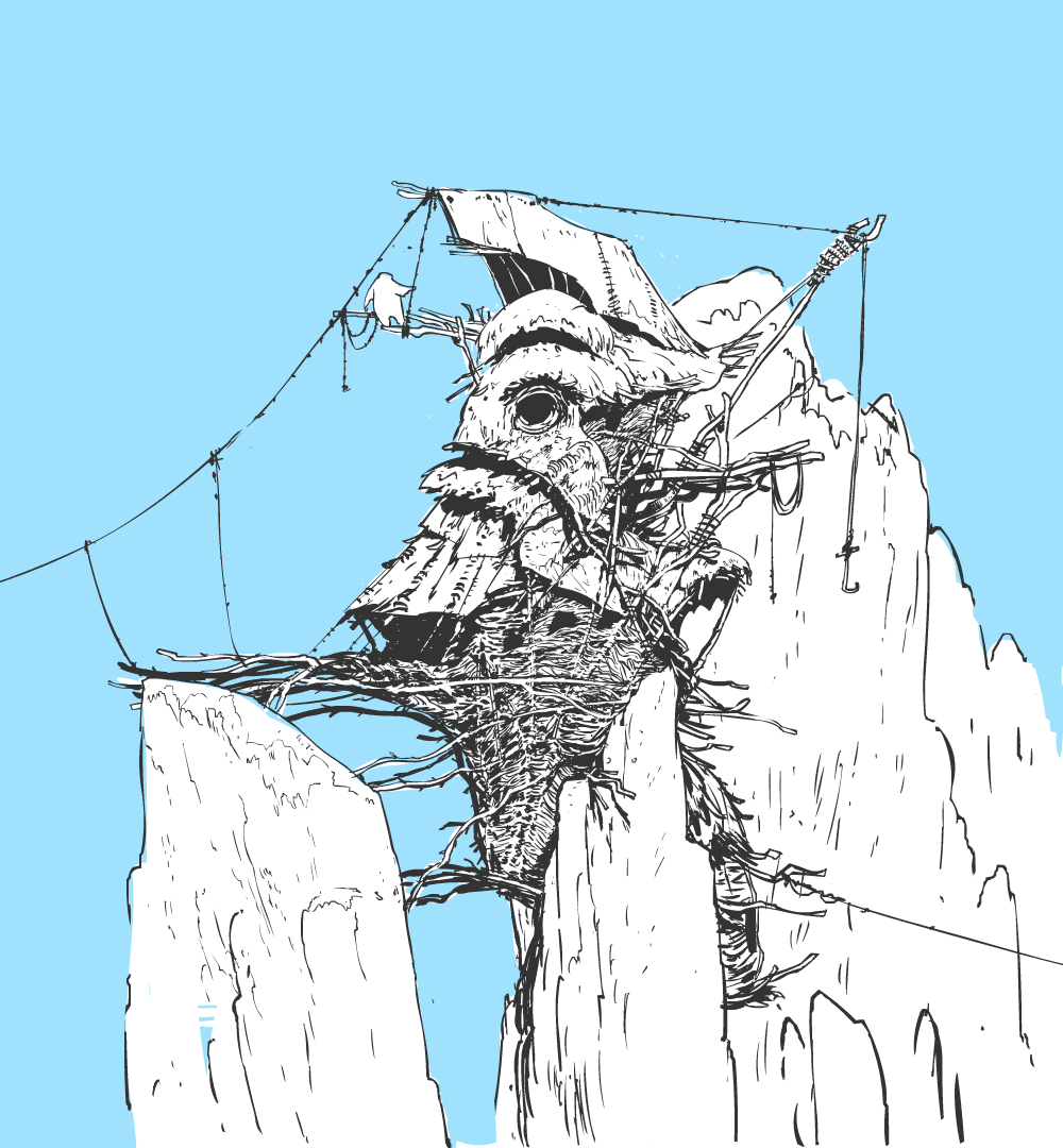
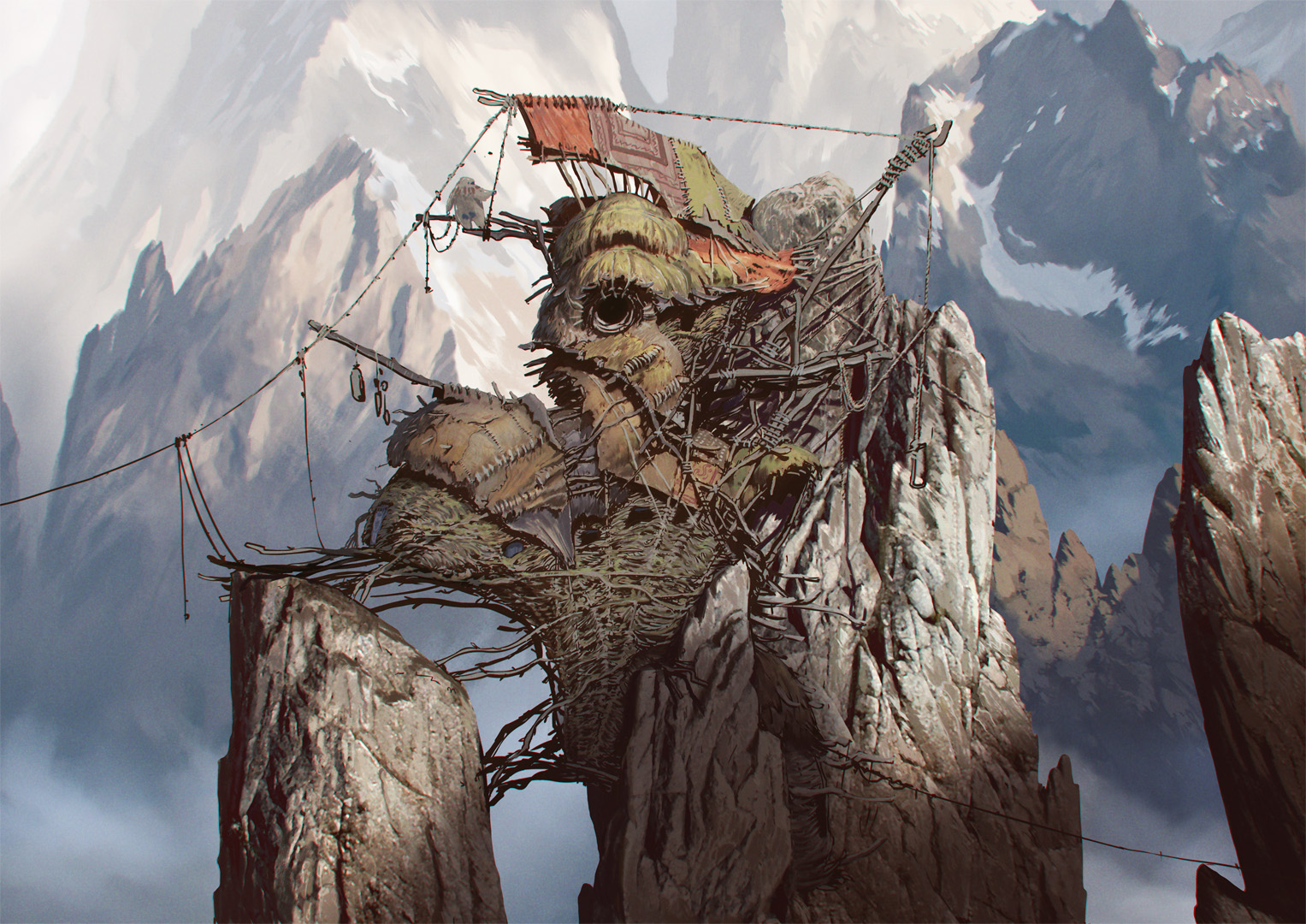
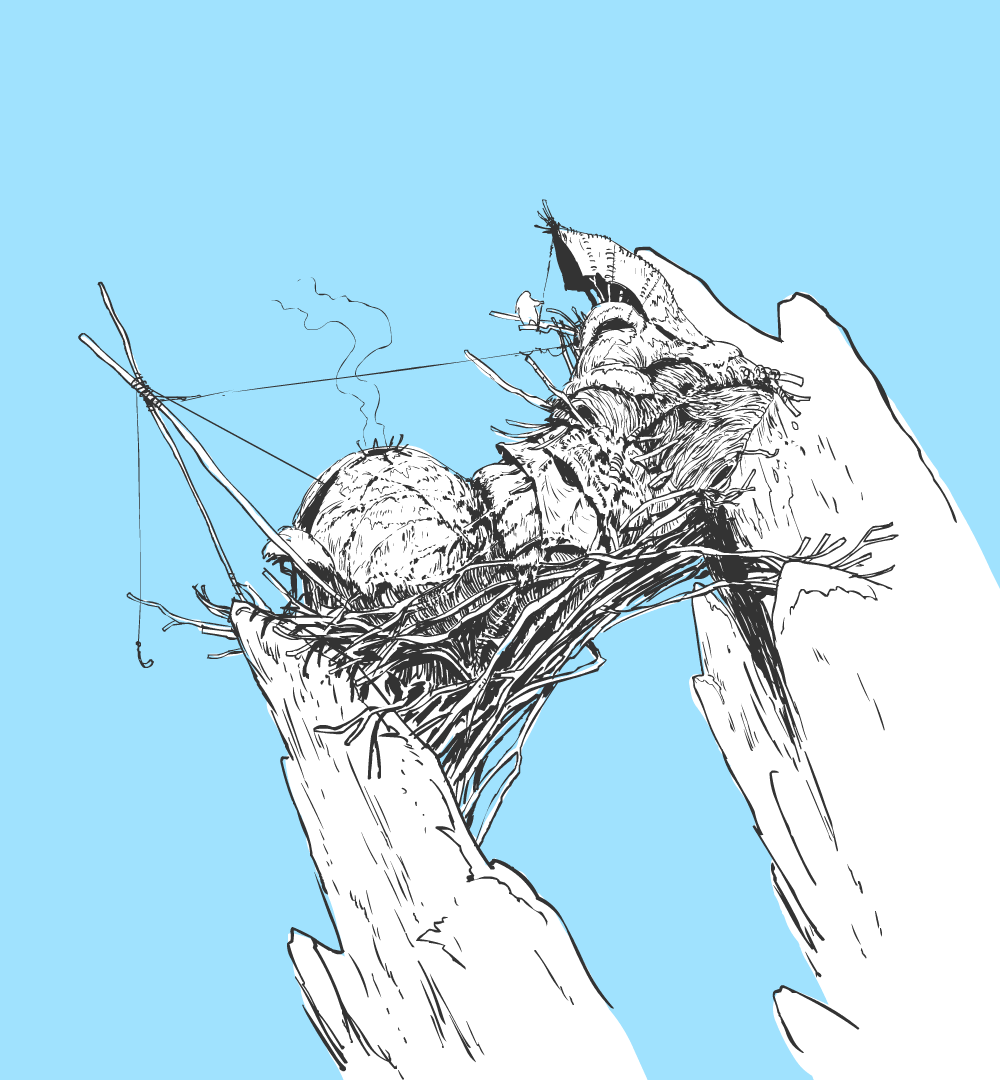
Yeti world would be an isolated, very deep valley surrounded by the sea of eternal clouds. We were exploring the idea of vertical structure of their habitat that would imply different climate zones. The lower they would go the more lush the ecosystem would be. That’s where they would get the food and building materials from. We thought it would be cool to find different type of yetis down there. (Sasquatch maybe?)
Couple of story moments. All the character sketches by Sergio Pablos, Juan Pablo Navas Rosco, Fernando Moro:
Other Projects
I spent the last couple of years working exclusively with the SPA studios. Sergio Pablos is unceasing source of ideas therefore apart from “Klaus” and “Smallfoot” I was engaged in other story developments. It’s a fascinating process and I enjoyed equally designing and contributing to the story. We prepared a lot of good pitches and some projects may end up as movies. We also helped other people developing their ideas.
Dragon Keeper - one of the projects we helped to develop. Characters sketches by Fernando Moro.
Ex-Tinct - one of the ideas coming from Sergio Pablos that we developed and sold out.
In the past
I worked as a concept artist and background painter on TV commercials, animated shorts and couple of feature developments. Occasionally I painted some book covers and illustrations for collective card games. I was also involved in many special projects like social campaigns, virtual scenography for theatrical play, architectural contests. As a self-taught digital painter I had to make my way up to feature animation through basically all kinds of design related jobs starting from web design, leaflets, software interfaces, flash animations and programming, 3D generalist, educational illustrations and so on. It took a while, but surprisingly I find this knowledge very useful whenever I need out of the box thinking.
Personal Gallery
Here comes a selection of illustrations that were mostly painted for fun.
Apparently I like painting SF theme, especially with a worn out, dense and heavy look.

